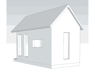
I got tons of thoughtful replies from friends and family, an architect, and even from a friend of a friend (whom I believe is also an architect.) WOW!
General themes that arose?
Leaving the kitchen window short, and doing something artsy on the exterior of the house, below the window, to "trick" the eye. (My second favorite idea.)
Having just one long window, and two short instead of the reverse. (My original idea... )
Turning the kitchen window horizontally. (My favorite.)
One industrious person even sent me three new sketch ups! Here is my favorite:
And so, I will speak with Daniel today and pitch my top two ideas to him. And, I'll see if he has learned anything yet by having calculations made regarding that much window space and stability/racking. And then - a decision will be made!
And for enjoyment, here is a gathering of all (I think I got them all!) of the responses:
What if the windows were to gradually move up a few inches: lowest for
dog view, 2nd one raised a few inches, then the 3rd one a few more
inches. It would be a "design".
* * * * * * *
Ok, I see what you mean - aesthetically that odd window doesn't
look quite right from the outside. I don't know about making the 3rd one
the same size though.. or if it was the same size, just flipping it
horizontally. OR halving it and then doubling it to make 4 small
windows..... or 2 wide windows.... but like you said, the bottom portion
wouldn't really be a window. Stained glass, or a funky chalkboard or
folk art or anything might work... or not. :) I kept thinking about some
of Any Warhol's prints, where it the same pic but in different colours.
* * * * * * *
I'll look and contemplate, but what about a window seat and ramp for Greta? Then you wouldn't have to worry...?
* * * * * * *
Short story - I don't think they have to be the same
size as long as the proportions are right. And a funky 'faux' window
would be right up my alley. I suspect that my house might end up looking
like a jumble of driftwood when I get around to it! Any-hoo, I think
your window dilemma is a great opportunity to add some art and personal
touches to your super duper house.
* * * * * * *
After looking at the drawings I think
you could put a marvelous painted panel to match the window size. So,
the kitchen window would be short as you have it, then under that to the
size of the other window you would have a painted panel. Like a
Scandinavian barn or house would have, or a Hex symbol like the Dutch
have, or a dove or something painted on the side. It would make it look
unique and like you actually planned to have that there.
* * * * * * *
I thought in the middle of the night that you could put a window box below that window, too, instead of a panel.
* * * * * * *
 I
can't really visualize all of that. I do firmly believe that form
should follow function; that is, your need for a bigger window is
priority over aesthetics. I think that problem could be conquered with
trim or something, something.....Go with your gut!
I think elongating all of the windows could cause (a) loss of wall
space (chair backs, etc... would not be under the window sills but
potentially touching glass) and/or (b) loss of privacy/security (much
easier to see inside as well as outside).
Symmetry is important but if you had to have a set of windows (one
on each side) for the dog I can't say that rises to the level of wonky.
* * * * * * *
I'm certain someone has already brought this up but maybe a peep window in the front door would be sufficient.
* * * * * * *

* * * * * * *
I think you do something that would trompe l'oiel. Do
what you want/need to do, and then we can figure out some sort of art
work, painting, etc. to make it appear to be similar, but it isn't.
I've seen sides of buildings that are fantastic - and they are
paintings. Who knows - maybe you could change that part of it
seasonally or something? So go for it, let Fido have the lower windows
everywhere it's possible, and we'll figure out the matching part at
decorating time.

No comments:
Post a Comment
Thanks for commenting! I love feedback.